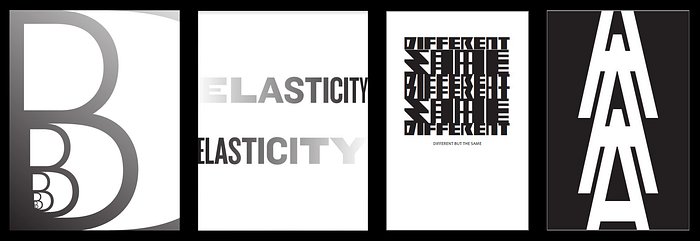
Diversity in Type: A Typographical Metaphor
In our first Senior Studio design project, Steve Kim, Rachel Wui, Fei Zhao, and I worked together to metaphorically express race and diversity through the use and study of typography.
Initially inspired by Hyperakt’s case study of its re-design of The Leonardo Museum. A museum dedicated to exploring the intersections of science, art, and technology. And by the current racial violence in the US and more specifically, the uprising of anti-Asian sentiment due to COVID-19. We wanted to find a way to combine all of our interests within the sciences and design into a unified project to speak on the issue of race that was directly affecting our community.

We began by asking ourselves a series of questions: How can we utilize design as a tool of communication to explain natural phenomena? Can we “debunk” racism through typography? Can the human species be compared to typography? What is race?
At the beginning of our design process, we weren’t sure how to tackle such a broad topic. However, with the help of classmates and Professor Grady, we first began by playing and studying typography. Focusing on the differences and similarities between typefaces from their appearance, structure, and multiusage.


Through multiple classroom critiques, it was concluded that the comparison was too drastic of a comparison, which we agreed with. So, we decided to focus on the type forms themselves and create 4 books and 4 animations to further explain our metaphor.
Book 1 is focused on current and real-world application of the power and connection of typefaces with the topic of race. This was shown by having images of different type used on protest signs and also having details of where and where the protests were.
Book 2 is focused on our interpretation and reaction through the exploration of the connection between typography and race. This book has some of our initial iterations as well commentary on what racism is.
Book 3 is focused on an outside source’s — Ibram X. Kendi — interpretation and words about race. Rachel Wui, focused on Dr. Kendi’s words and added in her own commentary and reactions through typography to the book.
Book 4 is focused on an overall explanation of this metaphor. We chose to end with this book because we thought it brought the whole series together to aid the explanation and understanding of the synthesis between the two topics: race and typography.


Then we chose to further bring together the idea through 4 animations. Each of a letter from the word “RACE”. We chose to do this because the animation shows the layering of each typeface, emphasizing how many different forms there are of one single letter. The viewer still knows that each form at its core is the letter-form, but that it simply looks different. We chose the word “RACE” to emphasize our topic and what we are trying to metaphorically represent through this project.
The topic and metaphor we were trying to express proved to have some difficulties, for us as the designers of this metaphor and as explainers to make this idea make sense to others. However, we enjoyed the process of exploring the design aspect of typography and learning the science and research behind the topic of racism. We hope that through some explanation of the material within our project, that the metaphor will still stand true and that the viewer can take away an understanding that there are so many different entities within our world that function similarly at their core, but simply differ in appearance.
Thank you for reading and we hope you all are doing well during this time. Signing off, from Zoom!
